The brief
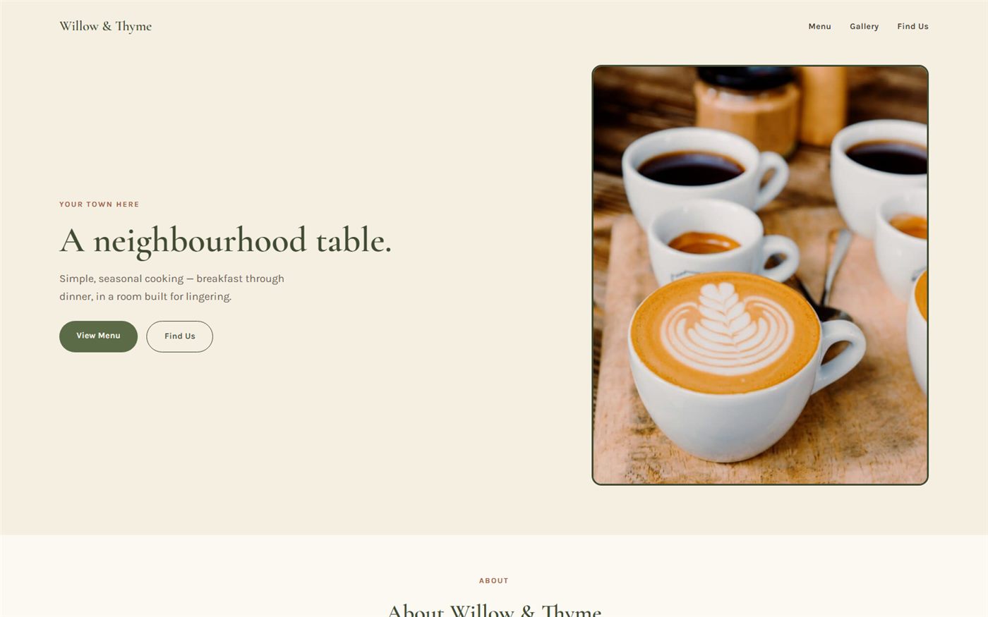
A breakfast-through-dinner neighbourhood restaurant needed a homepage that felt as warm and considered as the food, without leaning on the moody, dark aesthetic so many restaurant sites default to.
The approach
A warm cream palette, an editorial serif headline and real photography of the coffee and food keep the homepage light and inviting, with the seasonal menu presented as the clear next step.
The result
A bright, welcoming homepage that reads as premium without feeling formal — matched to a cafe built for lingering.
Website details
Desktop & mobile